

Data analysis is one of those skills students revisit every single year, and each time, the goal is the same: help them make sense of information in a way that feels real and meaningful. In Texas (and likely in many other states), the foundation begins as early as Kindergarten, using real-world objects and simple picture graphs to introduce basic concepts.
By first grade, students are working with tally charts and exploring both picture and bar graphs. In second grade, they begin solving word problems based on these visuals.
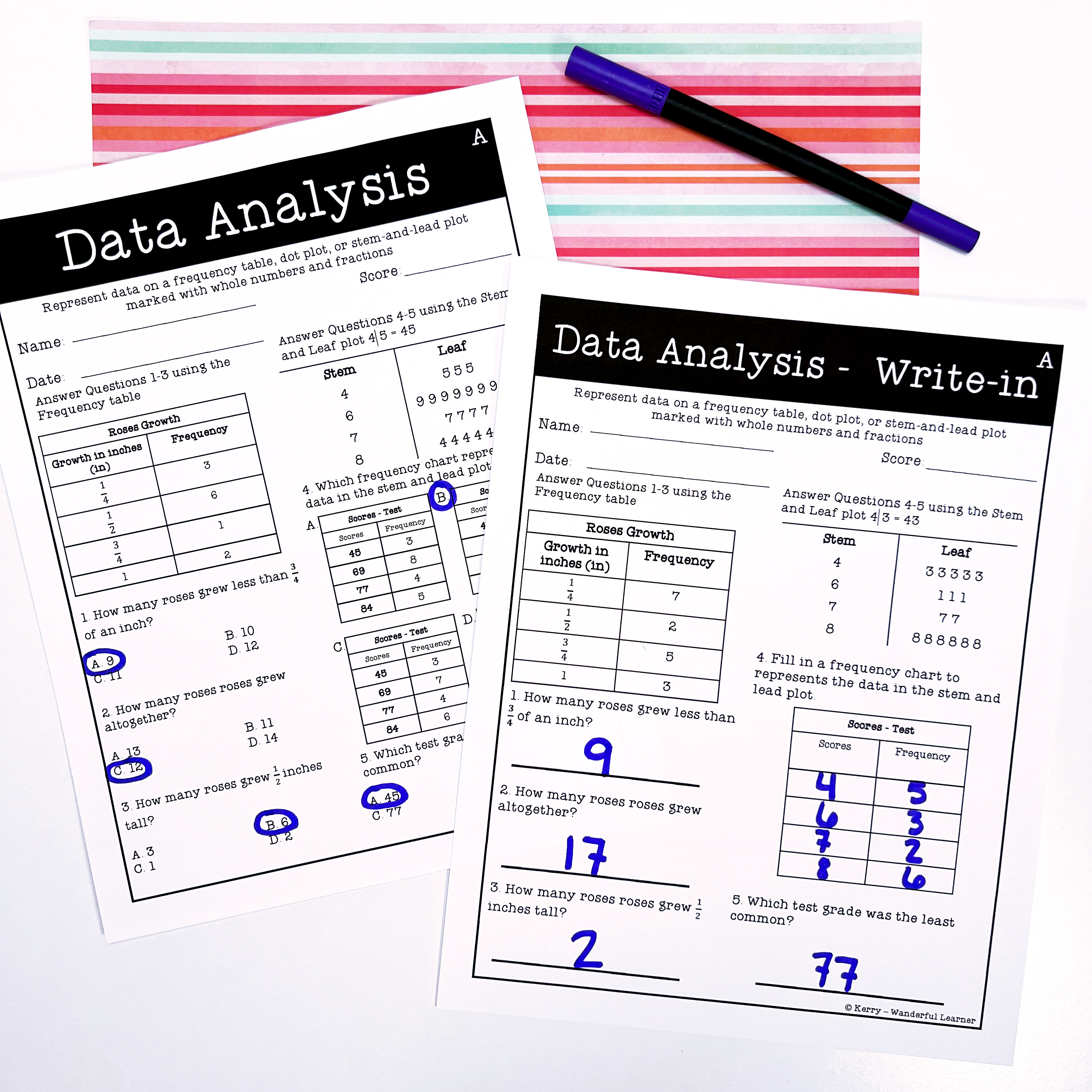
By third grade, data representation becomes more complex, with frequency tables, dot plots, pictographs, and scaled bar graphs. In fourth grade, students interpret and solve one- and two-step problems using whole numbers, decimals, and fractions—often presented in dot plots, frequency tables, or stem-and-leaf plots.
By fifth grade, scatter plots are introduced, and students tackle more challenging analysis and comparisons using a mix of data displays. Each year builds on the last, reinforcing not just how to read graphs but how to collect, organize, and interpret information meaningfully.
5 Types of Graphs Students Learn
Here are five data displays your students will see again and again…and how each one helps them think more deeply about information.
Pictographs
Pictographs use pictures or symbols to show data. Each image usually stands for a set number of items.
This makes it easy for students to visualize and compare quantities. Pictographs help students learn to interpret data through visuals.
This skill builds a foundation for understanding more complex charts later. Students can also use pictographs to create simple infographics from real-world information.

Frequency Tables
Tally Charts (Frequency Tables) use marks to count how often items appear in different categories. Every fifth tally mark crosses the previous four to form a group.
This makes it easy for students to quickly see totals in each category. Using tally charts helps students organize and sort data in a clear way.
These skills support more advanced analysis in later grades. Students can use them to survey classmates, tally votes, or track daily habits.

Dot Plots
Dot Plots show data points on a number line, with each dot standing for one value. This simple visual makes it easy to see data frequency and distribution.
Dot plots help students recognize patterns in how data is spread out. Learning to read dot plots builds skills for spotting trends and making comparisons.
Students can use them in science to show experiment results or in social studies to track population changes.

Stem-and-Leaf Plots
Stem-and-Leaf Plots organize numbers by splitting them into a “stem” (leading digit) and a “leaf” (last digit). This method shows both individual values and the overall data distribution. It helps students understand how data is grouped while keeping the original numbers visible.
This format bridges the gap between basic charts and more advanced statistical tools.
Students can use stem-and-leaf plots to analyze test scores, experiment results, or financial data like expenses and savings.

Scatter Plots
Scatter Plots use a grid to show how two variables relate. Each point represents one data pair. These plots help students spot patterns, trends, and possible correlations.
Learning scatter plots builds skills in comparing data and drawing conclusions. This is an early step toward understanding concepts like correlation and causation.
Students might compare study time and test scores or explore rainfall versus crop yield. They’re also useful for analyzing marketing data, like sales compared to advertising spend.

After students get the hang of these different data displays, I love giving them a quick, hands‑on activity that uses information from their own day. It makes the math feel real and instantly meaningful.
Try a “Data in Our Day” Quick-Collect Challenge
If you want a meaningful activity that doesn’t require prep or materials, this one is a winner. Students collect real data from their own day and use it to build multiple types of graphs — all in one quick lesson.
How it works: Choose one simple question the whole class can answer with a number. A few easy ideas:
- How many letters are in your first name?
- How many minutes did you read yesterday?
- How many pets live in your home?
- What time did you go to bed last night?
- How many steps do you think you took at recess?
Have each student jot down their number on a sticky note or scrap paper. Then, as a class, sort and organize the data on the board.
From that one data set, build several representations:
- Dot plot: Students place their sticky notes above the number line.
- Frequency table: Tally each value together.
- Stem‑and‑leaf plot: Great for two‑digit data like minutes read.
- Pictograph: Use simple icons or quick sketches.
- Scatter plot: If you collect two pieces of data (like bedtime + minutes read), plot the pairs.
Why students love it: It’s personal, quick, and instantly engaging. And because the data comes from them, they naturally want to talk about it, compare it, and make sense of it.
Why teachers love it: You get repeated practice with multiple graph types without needing multiple worksheets. One data set → many representations → deeper understanding.
Once students have collected their numbers, guide them in organizing the data using whichever display you’re teaching. If you’re newer to dot plots, stem‑and‑leaf plots, or frequency tables, don’t stress—there are plenty of friendly examples online. One site I love pointing teachers to is Math is Fun, because it breaks everything down with simple visuals and quick explanations that make the concepts feel approachable. Activities like this help upper elementary students see how data connects to their real lives, whether you’re exploring class preferences, reading habits, or anything else your students are curious about.
Activities like this build confidence and help students see that data isn’t just a math skill — it’s a tool they use to understand the world.
Want to Take Data Analysis Further?
For a simple, effective way to reinforce these concepts, check out my Data Analysis Anchor Chart Set. It includes visual aids and task cards for four key data types—bar graphs, dot plots, line plots, and stem-and-leaf plots. Making it a great addition to classroom lessons or home review.

If you want ready-to-go practice pages, my Data Analysis Worksheets set includes dot plots, stem-and-leaf plots, and frequency tables — perfect for independent work, small groups, or quick checks for understanding. (This set doesn’t include scatterplots, but it covers the three most common data displays students use in upper elementary.)
👉 Pin it for later!

Save this post on Pinterest so you can come back when you’re ready to try these data analysis activities in your classroom. Want to learn more essential math skills? Check out our guide on measuring angles with a protractor here!
Leave a Reply